You want a kitchen that feels calm but still elevated, and warm neutrals give you that balance. Creamy whites, greige, taupe, and sand set a soft backdrop, then walnut, matte black, or aged brass add structure and edge. You keep it from looking flat with honed stone, subtle veining, and layered lighting that actually flatters the space. The difference between “safe” and “stunning” comes down to a few key choices…
What Makes a Warm Neutral Kitchen Work?
Whether you’re invigorating a dated space or planning a full remodel, a warm neutral kitchen works because it balances softness with structure: creamy whites, greige, taupe, and sand tones create an inviting backdrop.
While these tones set a welcoming scene, intentional contrast—think walnut accents, matte black or aged brass hardware, and layered lighting—keeps the room from feeling flat.
You get a cozy ambiance when you mix tactile finishes—honed stone, slatted oak, woven stools—with clean-lined cabinetry.
You’ll also notice how smart color coordination makes the space feel tailored: repeat one metal finish, echo wood tones across shelves and flooring, and tie countertops to backsplash undertones.
For today’s trend-forward look, add sculptural pendants, fluted details, and a standout range hood.
Keep sightlines airy, and let textures do the talking.
Pick a Warm Neutral Palette That Lasts
A warm neutral kitchen feels tailored when your palette stays consistent across the big surfaces, not just the decor. Start with two to three grounded neutrals—think creamy oat, soft taupe, and warm gray—then repeat them in counters, backsplash tile, and flooring undertones so the room reads intentional.
Keep the temperature aligned: pair warm whites with honeyed woods and brushed metals, not icy chrome.
To keep it current, plan Seasonal color updates through linens, art, and small appliances instead of swapping core finishes.
Add Complementary accent highlights with clay, olive, or inky charcoal in barstools, pendants, or hardware details. You’ll get a look that feels modern now, flexible later, and cohesive in every light.
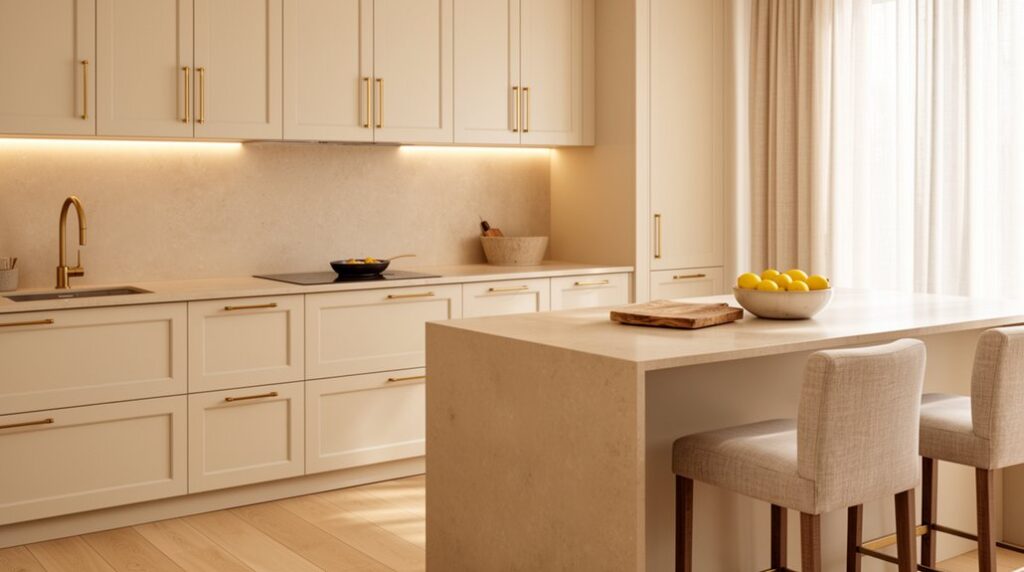
Choose Warm Neutral Cabinets and Paint Colors
Start with warm white cabinet shades that read creamy—not stark—so your kitchen feels bright yet inviting. Then pair them with today’s go-to wall colors, like greige and soft taupe, to add depth without visual noise.
You’ll want to test undertones in your actual lighting, because sun, LEDs, and shadows can shift a “perfect neutral” warmer or cooler fast.
Warm White Cabinet Shades
Because warm neutrals have replaced stark whites in today’s most requested kitchen updates, choosing the right warm white cabinet shade can instantly make your space feel calmer, brighter, and more high-end. Look for whites with subtle creamy or ivory undertones that soften shadows and flatter both natural and LED lighting.
If you love Cozy color schemes, pair these cabinets with warm woods, brushed brass, and beige-veined stone for an inviting, layered look.
For Modern neutral palettes, choose a clean warm white with a hint of sand that keeps lines crisp while avoiding a blue cast.
Test samples on upper and lower doors, then check them morning, afternoon, and night. You’ll get a finish that feels tailored, timeless, and designer-approved.
Greige And Taupe Paints
When you want warmth without the yellow cast, greige and taupe paints give you that perfectly balanced, designer-neutral foundation. You’ll get a tailored backdrop that feels current, calming, and easy to live with, whether your kitchen leans modern, shift, or classic.
Choose a soft greige to keep cabinets crisp while adding depth to walls, or go taupe to bring a richer, cocooning tone that still reads neutral. These shades make countertops look intentional and help hardware pop without screaming for attention.
For furniture pairing, you can mix pale oak stools, walnut dining tables, or matte-black chairs and still keep a cohesive story. Finish with accessory accents like warm metals, earthy ceramics, and textured linens to refine the look, not clutter it.
Undertones And Lighting
Even the prettiest warm neutral can flip on you if its undertone fights your lighting, so you’ll want to read cabinet and paint samples in your actual kitchen from morning to night. North light can pull gray-green, while sunny exposures push creamy beige and peach.
Under warm LEDs, that “soft white” cabinet might turn buttery; under cool 4000K, it can look flat or slightly pink.
To keep Color harmony, match undertones across surfaces: pair pink-beige walls with oak or almond cabinets, and reserve green-gray paints for walnut or mushroom cabinetry. Test next to your countertop and tile, too, because reflectance shifts everything.
Finally, tune lighting effects with layered fixtures—warm-dim under-cabinet, neutral overhead—so your palette stays consistent and high-end.
Warm Neutral Countertops That Won’t Feel Flat
To keep a warm neutral kitchen feeling elevated, you’ll want countertops that layer beige and greige rather than reading as a single flat tone.
Look for warm veining that echoes your cabinet undertones and adds movement without overwhelming the room.
Prioritize subtle texture—honed, leathered, or softly patterned surfaces—so your palette stays calm but still feels designed.
Layered Beige And Greige
Although all-neutral kitchens can skew one-note, layered beige and greige countertops bring in that subtle tonal movement that keeps the space feeling rich, not flat. You get a polished, current look without committing to stark white or heavy brown, and your kitchen reads calm yet designed.
Choose Layered neutrals that shift between sandy beige and soft gray so your cabinetry, floors, and backsplash feel intentionally connected. With smart color blending, you can match warm metals, creamy paint, or light oak while still keeping contrast against deeper islands or matte black fixtures.
If your home leans modern organic, greige anchors the palette; if you want classic warmth, beige leads and greige supports. You’ll also notice everyday clutter feels less loud, so your surfaces stay visually serene.
Warm Veining And Texture
When you want a warm neutral countertop that still feels elevated, lean into veining and touchable texture to create quiet dimension. Instead of a flat cream slab, choose stone or quartz with soft marble veining in caramel, taupe, or warm gray; it reads custom without shouting.
Keep the pattern scaled to your kitchen: delicate threads suit small spaces, while broader movement can anchor an open plan.
Pair the look with textured finishes—honed, leathered, or brushed—to blur fingerprints and add a tactile, design-forward edge. These surfaces diffuse light, so your counters feel calmer under pendants and daylight.
To stay cohesive, echo the veining tones in hardware or backsplash grout, then let cabinetry remain simple. You’ll get warmth, depth, and longevity with minimal upkeep.
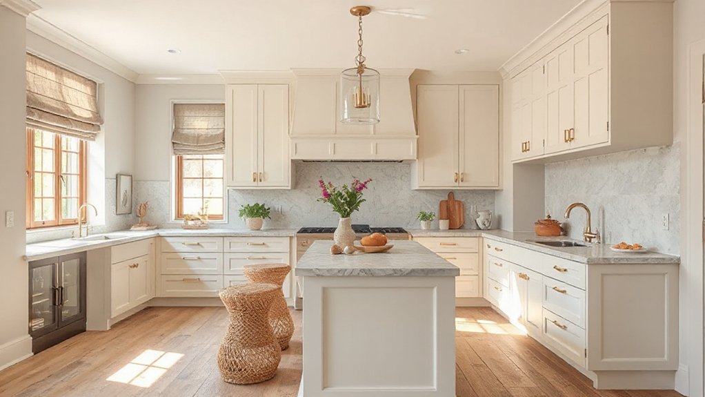
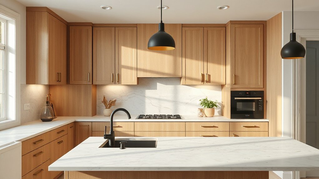
Add Wood and Texture to Warm Neutral Kitchens
Because warm neutrals can read a bit flat on their own, wood and tactile finishes give your kitchen the depth and lived-in character clients crave right now. Bring in white oak or walnut through open shelving, a statement island, or toe-kick details, and you’ll instantly warm up creamy cabinets and sandy stone.
Layer Rustic accents with restraint: a reclaimed beam hood wrap, a vintage stool, or a cutting-board wall that feels collected, not themed. For vertical interest, choose Textured backsplashes like zellige, fluted ceramic, or handmade-look tile; their irregular sheen keeps beige, greige, and clay tones from blending together.
Finish with woven shades, linen runners, and matte plaster walls so the room reads calm, dimensional, and quietly luxe. It photographs beautifully too.
Choose Warm Metals and Matte Hardware
If you want a warm neutral kitchen to feel intentional instead of washed out, swap cool chrome for warm metals and keep the hardware matte. Brushed brass, antique gold, and soft bronze instantly add depth against creamy paint, greige cabinets, or taupe stone.
Stick to one hero tone, then repeat it across pulls, faucets, and accents so your palette reads curated, not chaotic. Choose metal finishes with a low-sheen patina to hide fingerprints and keep the look relaxed.
For hardware styles, reach for slim bar pulls for a modern vibe, or stepped knobs and cup pulls for a tailored, vintage-leaning feel. Keep profiles simple and proportions slightly oversized; you’ll get a designer finish without overpowering your neutrals.
Warm Neutral Kitchen Lighting That Glows
To make warm neutrals feel rich rather than flat, layer lighting that casts a soft, golden glow and builds dimension after sunset. Start with recessed or a slim flush mount for even ambient light, then add pendants in warm finishes to spotlight the island and reinforce your palette’s cozy undertone.
Next, sharpen function with under-cabinet LEDs set around 2700K–3000K; they’ll make beige, greige, and taupe look creamy, not dull. Use Accent lighting inside glass-front cabinets or on open shelves to highlight ceramics, wood grain, and stone veining.
For modern Color contrast, pair matte black sconces with warm white shades, or mix amber bulbs with opal globes. Put everything on dimmers so you can shift from prep-bright to dinner-soft instantly.
Avoid These Warm Neutral Kitchen Mistakes
Great lighting gives your warm neutrals that after-dark glow, but a few common missteps can still leave the kitchen reading flat, muddy, or oddly cold.
Don’t pick every finish in the same beige family; you’ll lose Color contrast and the room won’t photograph well. Instead, pair creamy walls with deeper mushroom cabinetry, aged brass, or a charcoal runner to sharpen edges.
Avoid ultra-cool whites in quartz or backsplash tile, which can make taupe look pink or sallow; request large samples and view them morning and evening.
Skip overly yellow bulbs that turn greige into butterscotch.
Finally, watch furniture placement: stools jammed tight to an island or a table blocking the work triangle makes the space feel cramped, not curated.
Frequently Asked Questions
How Do Warm Neutrals Affect Kitchen Resale Value and Buyer Appeal?
You’ll boost resale value and buyer appeal by choosing warm neutrals; they feel inviting and updated. Neutral color psychology signals calm and cleanliness, while warm neutral palette trends photograph well, broaden tastes, and help buyers imagine moving in.
Are Warm Neutral Kitchens Suitable for Small, Low-Light Apartments?
Yes, you can make them work well in small, low-light apartments if you choose smart Lighting options like warm LEDs and under-cabinet strips. You’ll boost depth with Texture contrasts—matte cabinets, glossy tile, veined stone.
Which Warm Neutral Finishes Are Easiest to Keep Clean With Kids?
Choose matte quartz counters, satin-finish cabinets, and large-format porcelain tile—they’ll wipe clean fast. 70% of parents clean spills daily. Prioritize stain resistant finishes and kid friendly surface treatments like nano-sealed grout and washable paint.
How Can I Update a Cool-Toned Kitchen Into Warm Neutrals Affordably?
Start by shifting your color palette with warm paint, cream backsplash peel-and-stick, and brass pulls. Swap cool bulbs for soft LEDs. Add wood stools and a jute runner—smart furniture choices that feel current. You’ll stay budget-friendly.
Do Warm Neutral Schemes Work Well With Colorful Appliances or Backsplashes?
Yes, you’ll make warm neutrals shine with Colorful appliances and bold backsplashes. You anchor the palette with creamy walls and wood tones, then use backsplash coordination to repeat one accent color for cohesion.
Conclusion
You’ve got the formula for a warm neutral kitchen that feels elevated, not bland: layer creamy tones with greige depth, then sharpen it with walnut, matte black, and aged brass. Keep cabinets and paint soft, choose honed stone with subtle veining, and build texture with woven accents. Light it like a boutique—warm LEDs, dimmers, and glow zones. Skip icy whites and busy patterns. Done right, it’s like a Casablanca nightclub, timeless yet current.